


Some time ago, I was discussing Elif Şafak with a Turkish friend. I mentioned that I was reading The Bastard of Istanbul, and after a bit of Googling we worked out she had read it too. “It has a pomegranate on the cover,” she said to confirm. I got out my book and found that the English edition had a mosque on the front.
As I continued to read, I realised that a pomegranate on the cover really makes more sense. It unlocks the story — the image somehow perfectly illustrates the family secrets bursting to get out. The mosque on the English edition doesn’t really relate to the book at all. So, why the mosque?
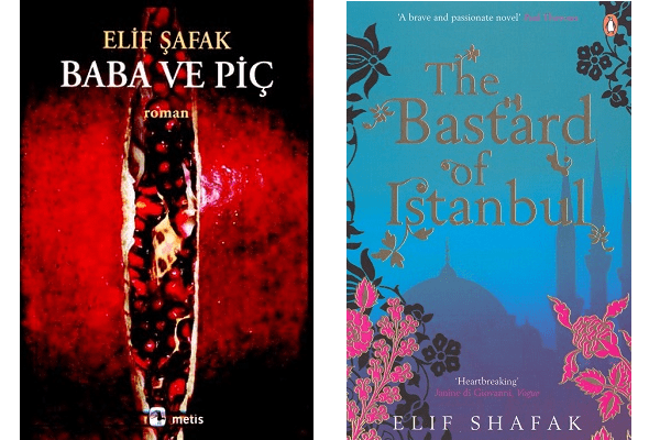
In my local book shop recently I noticed that this enigma was not confined to The Bastard of Istanbul. In fact, the vast majority of English-language books by Elif Şafak and Orhan Pamuk, arguably Turkey’s biggest literary exports, have covers with either a mosque or something similarly ‘Eastern’, such as Moorish arches or Iznik tiles.
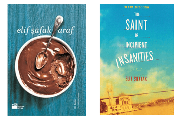
Take Araf / The Saint of Incipient Insanities. With characters from all over the world and largely based in Boston, it’s a story about displacement, nationality, belonging and exile. The main character falls in love with a complicated chocolate maker and this point is vaguely illustrated on the Turkish cover. But on the English version there’s a picture of the Ortaköy Mosque.
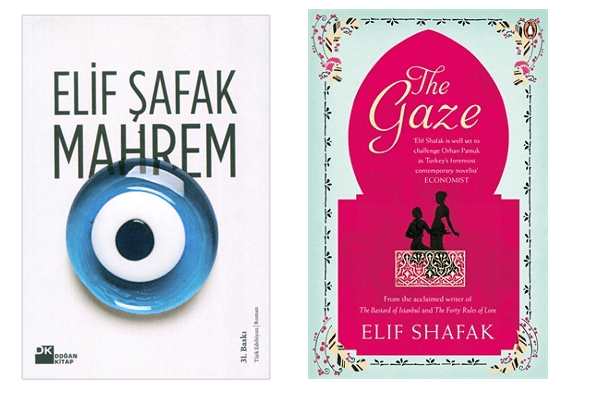
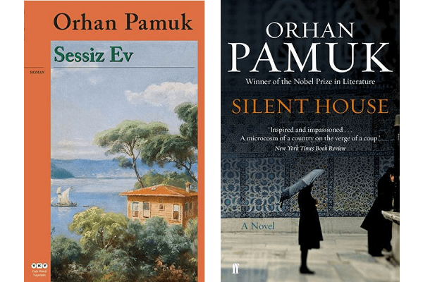
Silent House is about political tension, family relationships and youth, but the cover looks like a Topkapı Palace guide book. While The Gaze examines body and image through the story of an obese woman and her dwarf lover in the 1880s, they seem to have gone for an ‘Eastern Chic Lit’ look with the cover on the English-language edition.
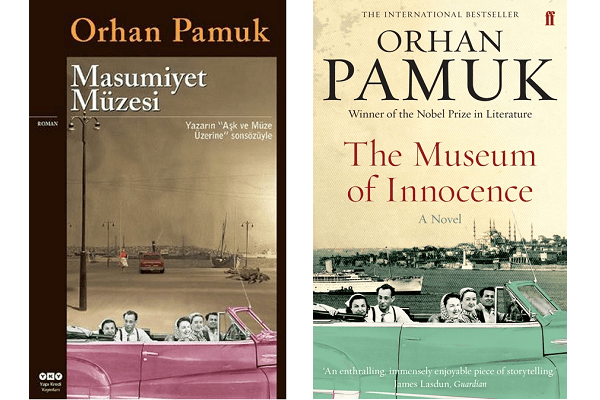
Masumiyet Müzesi / The Museum of Innocence has gone for exactly the same cover design, but they’ve swapped out an industrial Istanbul background for a mosque. I can just imagine the meeting at the English publisher: “Yeah, we really like the cover. It’s bold and graphic and will work well in the English market. But could we make it a bit more … you know … Turkish.”
I understand the need to change covers and titles for different markets, and of course sometimes the subject matter dictates the cover. We can excuse the use of Ottoman dress and Iznik tiles on My Name is Red, for example, given that the story revolves around miniaturist painters who served in the sixteenth-century Ottoman court.
But are most of these books best illustrated by mosques and Moorish arches? Or are English publishers (and audiences) indulging in a bit of Orientalism?
Elif Safak
Mahrem / The Gaze (2000/2006)
Araf / The Saint of Incipient Insanities (2004)
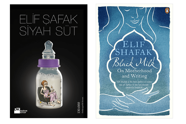
Siyah Süt / Black Milk (2007/2011)
Iskender / Honour (2011/2012)

Orhan Pamuk
Sessiz Ev / Silent House (1983/2012)
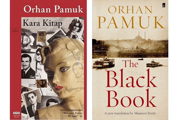
Kara Kitap / The Black Book (1990/1994-2006)
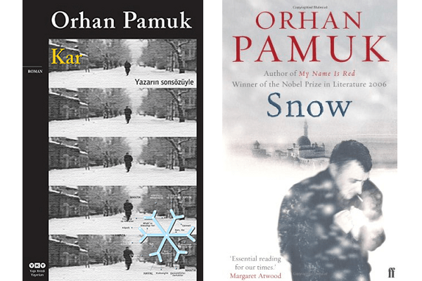
Kar / Snow (2002/2004)
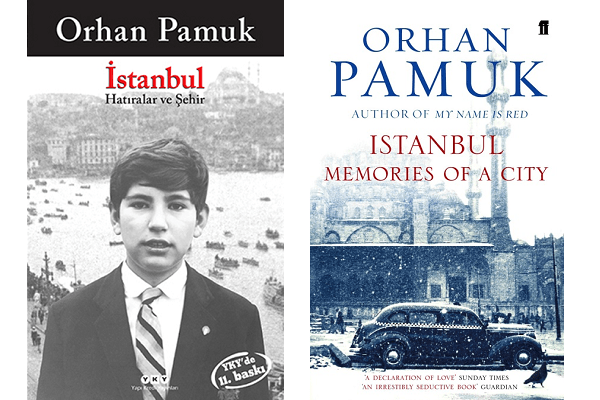
İstanbul: Hatıralar ve Şehir / Istanbul: Memories of the City (2003/2005)
Beth Thomas is a contributor to Yabangee


that is how Turkey is changing….
[…] they were expecting to see is something I try not to delve into too deeply, even though my internal Orientalist-meter perks up a bit). I think what people often mean is that daily life here for most expats is, on the […]
Great observation.