Home of the Design Biennial and a (gradually) increasing number of design and architectural gems, Turkey is finally becoming a name on the design map. One can only hope that this will be the beginning of the end for soulless shopping malls, clunky websites and comic sans. But while design has been neglected by many, there are a few examples of design that shine through. Here’s my top five old-school design gems.
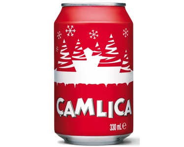
Çamlıca
There’s something about Çamlıca that makes me thoroughly happy. It’s a combination of the dancing letters, the charming little snow scene and the beautiful simplicity of the design. It stirs a nostalgia for summer days from my childhood, and I’m not even Turkish.
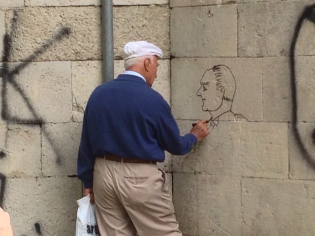
Atatürk in Profile
Turkish politics can sometimes be a bit shouty, and it’s only getting louder in the run-up to the elections. You can’t move for fly-posts, banner, billboards, graffiti, flags and roving buses, which are quite literally shouty. But among this hubbub is a quiet, determined figure that catches your eye all over the city. Atatürk’s profile is so recognisable and stands for so much that even a simple pen drawing can say a lot. Proof that the biggest impact isn’t always from the person that shouts the loudest.
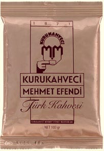
Kurukahveci Mehmet Efendi
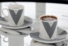
If they drunk Turkish coffee in Metropolis, this would definitely be the brand of choice. A brilliant Art Deco design and a great example of what people thought the future looked like in the past. Designed in the 1933, the company has stuck with it ever since, and for good reason.
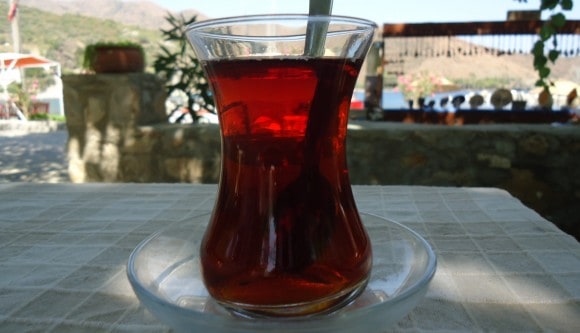
Turkish tea cups
When tea first arrived in Turkey, I’m not sure which bright spark came up with the idea of drinking boiling hot liquid in a brittle glass. But for some reason this practice stuck and now drinking tea out of anything else is unthinkable. Sure, you can experiment with shape and size, maybe add a handle, but the tea still tastes best out of a delicate, tulip-shaped glass.
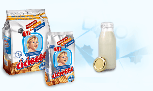
Cicibebe
Yes, the baby is slightly terrifying (why does it look so plastic?) but Cicibebe is a paragon of Kitsch. And it’s not just the airbrushed infant. Look at the font! I haven’t seen bubble lettering like it since primary school.
What Turkish designs do you think are particularly rad, dear readers?
Beth Thomas is a contributor to Yabangee





This logo!! http://www.fescafe.com/