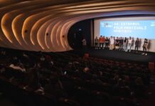
At its core, the 2nd Istanbul Design Biennial, titled The Future Is Not What It Used To Be, encourages you to think and rethink where we have come from, where we are, and where we are going. Listening to the director and curators of the biennial speak at the opening media conference, this theme really hit home for me — this is my kind of biennial.

I have a long history, going way back, with IKSV, but this was my first time at the Istanbul Design Biennial. And I have to say that I was impressed. While it’s not necessarily fair to compare them, I found this biennial to be more engaging and captivating than the biennial I attended last year, the 13th Istanbul Biennial.
This year the Design Biennial is being held in the Galata Greek Primary School. It may look like a humble building from the outside on Kemeraltı Street in Tophane,. However, its soul and history make it an undeniably perfect location for the biennial. Although, I will admit that I had a hard time finding the place — even worse, I, the local who is supposed to know the city like the back of my hand, was guiding a British visitor around. A lot of the people who work in the area weren’t even familiar with the school; I asked for directions from one of the grocery store owners and he replied, “You are the tenth person to ask me that this morning — tell me child what’s going on there?” Hopefully holding the Design Biennial here will help bring more attention to this beautiful old building.

I spent almost all of Thursday morning taking in the media conference and the preview. At the media conference we heard from Zoe Ryan, the curator of the biennial and the chair of the Department of Architecture and Design at the Art Institute of Chicago. Her enthusiasm was palpable. I don’t know how many times she said thank you to the foundation and gave credits to the crew behind. After the conference, Ryan and Meredith Carruthers, the associate curator, guided us through the exhibition. It was an enthralling tour, and they spoke about their perspectives on the designs.
Even more than that, the designers were waiting — maybe better to say hanging out — in the rooms where their works were displayed. They were smiling, gauging the audience’s reactions, and willing to answer any questions. It was clear that they were happy to be there and having a good time. I had the same impression of the rest of IKSV crew, too. These feelings were flowing both ways; their energy was contagious and encouraged us to discover more.
And discover we did. I found myself walking through the floors, standing in front of the white, smooth walls of the school that were covered with designs and questions, squinting my eyes, and trying to make a personnel connection with the works. After looking at the descriptions, I often made a small noise of recognition: ”Well, well, I got ya” or ”Hmm, interesting point.” So many words came to mind: smooth; simple and clear; genius; original; honest; unique. The whole exhibition reminded me of a conversation I had with a friend who is currently an architecture student. She was talking about design and mentioned the modernism motto: ”form follows function.” Some things don’t have to be adorned or ornamental, and the biennial aptly demonstrated this point.

One of my favorite parts of the biennial takes place on the top floor. There, ABC Manifesto Writers & Consultants will write you a bespoke manifesto, catered to your wants and needs. They caught me off guard, and I soon found myself with my own manifesto. It was truly a first! Her was how it all went down:
- Get your basket in the entrance.
- Go to the library and choose your object.
- Get an inspirational quote from the documents on the left.
- Get your psycological test, learn your points and consult them. Choose another item.
- Put your item in the mirror-wardrobe. Go inside. Press the button. See that you hate the item and scream like hell.
- Choose your action cut from the screen.
- Go to final machine and give them everything you’ve got.
- Get your manifesto.
- Go in front of the camera and read it out loud.
- Destroy it!
Once you complete the process, you will have had a weird, unique, funny experience that is fully your own and is now gone. It’s a great way to be more involved with the exhibition, so there is no need to be shy — even the screaming in public part is quite fun.
To see what’s going on, check out the huge blackboards located in the main hall of the Galata Greek Primary School. With 53 different projects, there is certainly a lot to see. You can also take a guided tour, which is a good option for those who want to hear more detailed information on the works and designers.
As Ryan said, “Istanbul has a thriving creative community, so it seems an especially appropriate city in which to reflect on the field of design.” I wholeheartedly agree. I greatly enjoyed my time at the exhibition, and especially the conversation it sparked with my friend afterward as we sat in one of the many cafes in Karaköy. So I’d recommend taking advantage of the free admission and checking out the 2nd Istanbul Design Biennial. My only advice: Be patient, take your time, explore every floor, and enjoy the ride.
For more information on the Biennial, check out their website. The Biennial runs until Sunday 14 December.
[geo_mashup_map]

