I’m giddy and excited as I enter the Magnum Contact Sheets exhibition at the Istanbul Modern. This show provides a look at some of the most iconic (American-made) images of our age, and their accompanying contact sheets, all taken by Magnum photographers. This exhibit goes behind the scenes at Magnum, an exclusive group of photographers formed in the 1930s and still practicing today, and explores not just timeless images put out by the group, but also the contact sheets behind them. As explained by the Istanbul Modern: “A contact print is obtained by exposing an image or a set of images against a single sheet of photographic paper of the same size as the negative.”
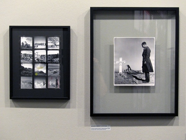
Having been a photographer for the last twenty years, I am intimately acquainted with the contact sheet. It’s true for me, as the show’s wall text further suggests, that the contact sheet is a sort of private notebook, sketchbook, or diary. It can, “give clues as to the artist’s working process [and] the way they approach the subject matter,” providing fascinating and often unexpected context. A contact sheet usually shows an entire roll of film, the images displayed without any manipulations. Typically, the world sees only the best or most useful frames from any given roll; often that is just one frame. The contact sheet presents the images that are not shared or made public for any number of reasons.
Expertly shot and printed, these original photographic prints with their accompanying contact sheets at the Istanbul Modern provide a lot of fodder for visual investigation, and enjoyment for the eyes and mind. However, I was not impressed with the written context provided for the show. The accompanying text, which acts to further the agenda and myth of the photographer, runs the risk of overshadowing the actual contact sheets, which each tell a compelling story all on their own. Conveniently, this text is mostly placed too low to be comfortably read by an adult of average height, making it easy to avoid. My suggestion? Spend your time at the exhibition looking, not reading.
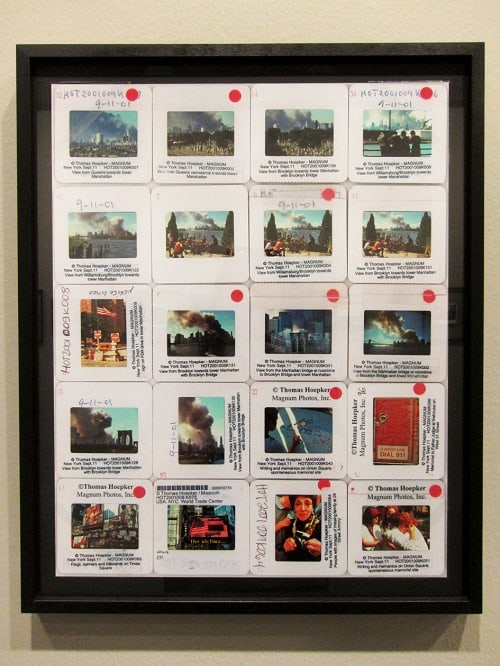
(© Thomas Hoepker / Magnum Photos)
Provided text suggests that the traditional contact sheet is now “historic,” but somewhat contradictorily there are a number of diverse contact or ‘proof’ sheets on display, offering many examples of its inevitable evolution. For instance, the contact sheet by Thomas Hoepker, which depicts the tragedy of 9/11, is a set of slides which are set over a white piece of paper on a light box, and then photographed. In strict technical language, this is not a contact sheet, as no contact has been made with light sensitive paper, and the slide images are shown at larger than their actual size. Moving further from tradition is the ‘contact sheet’ of Mikhael Subotzky taken in 2006. This sheet is displayed in the form of a screen shot and is a common modern day proofing method for digital captures and scanned film alike.
For photography shot on film, a proof sheet holds a special magic. In a traditional camera (one with a physical shutter and mirror), a photographer is made blind at the moment a frame is taken. The shutter closes, the mirror moves down and though the photographer’s eye is open, their view is obstructed in that fraction of a second it takes to expose the negative. The photographer anticipates and expects, but does not see or know what has been captured until the negatives have been developed and a contact sheet is made. The first look at a contact sheet can be crushing or exhilarating, or both. Sometimes, an image clearly distinguishes itself from the chaos of a contact sheet – leaping from the page – and for an artist, this is ecstasy. Other times, it hides, only being discovered after numerous investigations with a magnifying glass. This is magic. However, I believe that when presented to the public, who likely have no first-hand knowledge of, or perhaps no interest in this more traditional process, it is difficult to convey the multitude of feelings it can cause for the artist. I’m not sure that people will be more moved by these analogue contact sheets than by their modern day digital counterparts — the art lives on its own and is not based in the artist’s experience of creating the work, unless that experience is somehow present or inherent in the final object.
The highlights of the show include grainy black and white images by Robert Cappa that were captured on D-Day. Likewise, the unfolding of a portrait session with iconic surrealist painter Salvador Dali, taken by Philippe Halsman in 1948 is a joy. This set of contact prints begs one important question, which is not addressed in the provided context, namely, was the rear painting in the image added later, in the darkroom? The clear, but somewhat less obvious highlight for me was Chris Steele Perkins’ image, taken in 1997, which itself looks like a proof sheet from a malfunctioning camera. With black spaces between each window of light, he was shooting through a brick ‘fence’, which provided a series of seemingly disjointed scenes viewed through each “frame” all within a single larger frame. But here, again, is a clear example of the text working too hard; in it, Perkins explains the lens he used, that he needed to find something to stand on, and his opinion of the founder of the asylum he was photographing, all of which are unrelated to the story that this fascinating image and contact sheet aim to tell.
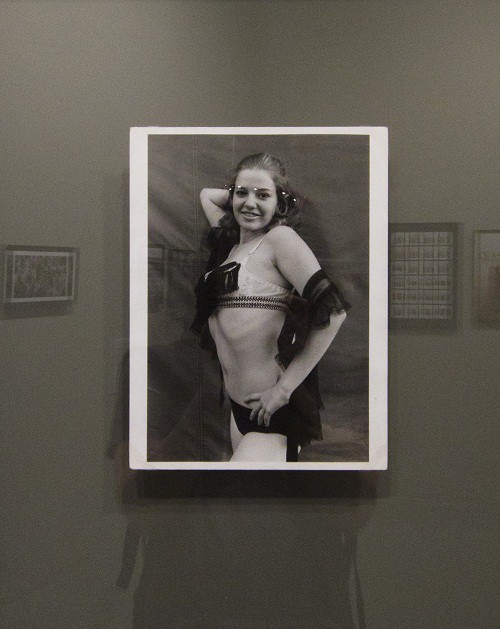
Text not withstanding, these contact sheets offer a glimpse beyond the veil, like seeing the under painting or unedited manuscript of a great work. They expose the many choices presented to the photographer. Images range from extremely intimate portraits in the bedrooms of everyday people, to portraits of famous public figures at events watched worldwide. Personally, I am inexplicably drawn to images of women photographed by women. There are a few beautiful examples here, including Susan Meiselas’ work photographing circus performers in the American Midwest from 1973-75. In her provided proof sheet one can see the many choices she was confronted with and what story she decided to tell. The images on the contact sheet are in turn salacious, fun, unnerving, creepy, and exuberant. Meiselas’ choice seems to highlight the youthful character of her subject, and the subject’s possible naiveté in contrast to her current profession.
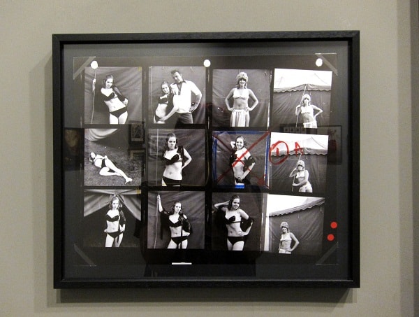
We can see in Meiselas’ work how only one specific angle was chosen, despite the fact that there were many stories to be told. Yet once the image is printed, this particular perspective is swallowed whole, as the ‘truth’ or ‘reality’. This editing process is but one layer in the many manipulations that go into the creation of a photographic image. Many people have the impression that photographs, especially ‘analogue’ photographs, are true – but these contact sheets will show you many truths, some contradictory. Here then, the tricky nature of photography is exposed. A shrewd editor (in the case of Magnum, usually the artist) shows you what to see, and thus influences how you think about a subject. This is true for any artist, and is used by editors in advertising and editorials to shape and contribute to a story or agenda.
Overall, the artistic content of the show was impressive, while the provided framework was less so. Adding to this troublesome frame is the homogeneity of the artists — there were only six women and three non-European/American artists in a field of 57. I was hoping for a more contemporary discussion about the medium, but found that the misplaced nostalgia for “analogue” did not allow for a nuanced examination of the common misconceptions and myths surrounding photography.







[…] shows into a space (this involves essentially bypassing the curator, something I witnessed in the Magnum exhibition at the Istanbul Modern), and curator positions that sit vacant are some of the common reasons why […]