That Istanbul is a force to be reckoned with in the contemporary art world is undeniable. You just need to look at spaces like Sakıp Sabanci, SALT, Pera Museum, Borusan Contemporary, or events such as the Istanbul Bienal, Contemporary Istanbul, or Mamut Art to realize that the city is a major cultural hub.
Now two new recently opened spaces have arrived to empower this trend. And they share many similarities in their different approaches to contemporary art exhibition.
The first, Arter, boasts a newly opened space for the long-established gallery, once on Istiklal and now in Dolapdere, a central neighborhood that is quickly transforming from a run-down area to one of Istanbul’s hottest art districts due to a gentrification around its main axis Dolapdere Caddesi.
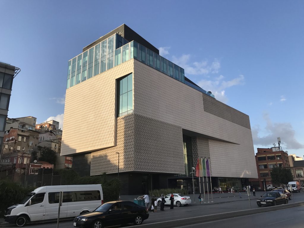
An international competition took place in 2013 to decide on the design and it was awarded to London-based architecture firm Grimshaw Architects, which among working on many other buildings, designed the new Istanbul airport. The construction of the building started in 2015 and was completed in 2019.
On first look, the building gives the impression of a carved block of terracotta with multiple cracks. By breaking free from a traditional form, the ‘stacked box design’ allows light to reach dark corners of the building while creating extensions that turn into private terraces.
The façade made of glass-fiber reinforced concrete plays with the contrast of 3D solid and empty rhomboid panels that are complemented with glazed and ceramic surfaces. These ‘masks’ allow the light to filter through the building and create geometrical shadows that change throughout the day.
The building is conceived as a dynamic multi-layered space, more transparent and integrated on the ground floor, with hardscape and water layers that extend into the public space, but that become more estranged and introverted in upper floors, with even sculpture terraces that deny the interior-exterior dialogue.
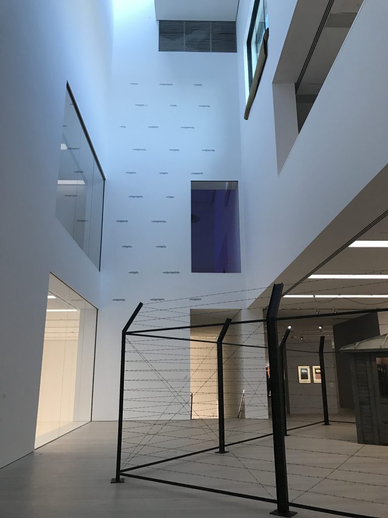
The art museum has six floors and more than 13,000 m2 of exhibition space, two performance halls, learning studios, a library, a bookstore, a bistro, and a backyard for outdoor events. The triple height entrance gallery creates a central void that serves as a visual reference at any time as the visitor travels through the building. The exhibition center follows a vertical route and multiple story height voids allow the visual connection between spaces. Large picture windows open the building to the street and connect the gallery to the city in an interesting contrast of a modern frame capturing a traditional neighborhood picture.
If you have ever been to Casa da Musica in Porto you’ll find the many similarities of both spaces: like an asteroid that crashes on a distant planet and breaks into multiple pieces, this ‘alien’ interacts in its corners and cuts with the foreign environment, responding with a series of interconnected exhibition spaces that promote internal interplay and connectivity.
Antrepo 5 responds to a transformation of an existing warehouse building into a contemporary art museum. Designed by the famous Turkish architect Emre Arolat, the reinforced concrete structure is kept as it is, while the walls and floors are stripped away in order to obtain a 3D, naked structural grid which houses the ‘art containers’ of the new museum.
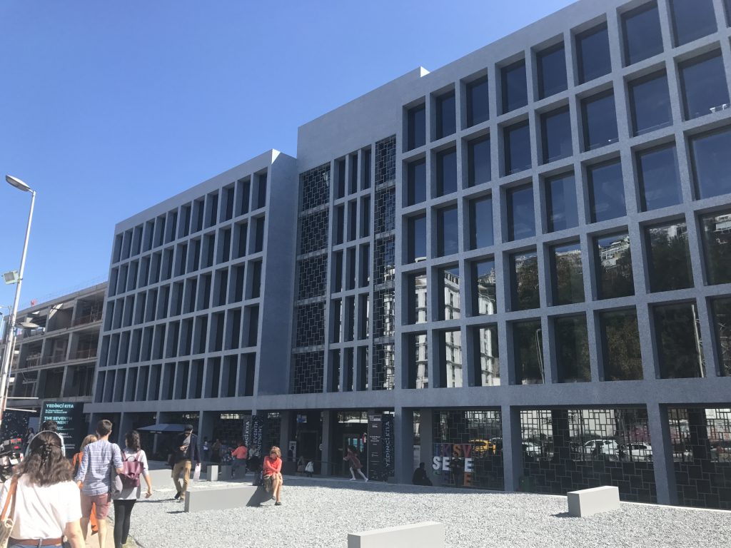
The design reinterprets the old warehouse façade with a rigid grid and allows the ‘guts’ of the building to overflow from the sides. The building, as Arter does, proposes a vertical path that starts on the ground floor and, through superposed rings that allow glimpses of the city through the naked structure, ends up on a minimal terrace. The top terrace is still not open to the users to be able to assess the experience in its totality. The building seems to ignore the topography of Istanbul (the top part can be seen from many spots of the neighborhood) and leaves (against the initial physical model that proposed a big red box) all the innards of the building to plain view.
The building lacks some of the excitement shown in early renders that promised an exciting bare bones transparent building with red containers trespassing its body. Instead we get a very correct, very sober, very grayish building where the exciting pixelated water layers have been replaced by grey stones. The grey dominates in a building that should celebrate color and art.
Due to the high density of the Galata Port project, the building is now surrounded by other volumes at a very close distance which doesn’t allow it to breath or have the projected public space in the backyard.
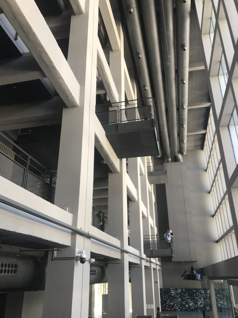
The media-mesh on the back wall of the museum that was supposed to rejuvenate the facade facing the busy road and act as an interface between the new museum and the city is, at the moment of writing this article, absent.
This new art museum is a commendable and potent idea that in it’s realization suffers the classic problems of Turkish construction: the finishing of the beams and detailing is sloppy and the attractive first ideas are diluted into banal solutions.
Both buildings, Arter and Antrepo 5, represent the perfect analogy of Istanbul: they are contrasting and contradictory animals. While at first look they may seem ‘aggressive’, once you willingly go through its cracks you discover fascinating spaces and exciting events. Even if you would call them ugly, you can see the inner beauty on them and the tremendous potential in their apparent chaos. They perfectly embody the contrast between the strongly traditional and radically contemporary that defines Istanbul.
Images courtesy of the author.


